With the Image Manager Extended you can
- Upload images and resize and thumbnail them on upload
- Create folders
- Rename, cut, copy, paste and delete folders and images
- Create and delete image thumbnails
- Edit Images in the Image Editor
- Create Rollover images
- Create Image Popups (requires JCE MediaBox or a compatible JCE Popup Extension)
- Insert images into articles

Interface
The Image Manager Extended interface, like all standard 'Manager' plugins (Image Manager, File Manager, Media Manager etc.), consists of 2 sections, the Attributes section, and the File Browser section.
Attributes
This section is divided into 4 parts, each accessible by clicking on the named tab. The default tab display is of the Image section, which contains the fields that represent the main image attributes of the currently selected article image, or the image to be inserted into the article.
Image
Set the most common attributes for the image including URL, Description and Dimensions. See Inserting an image
Rollover
Create rollover images. See Creating a Rollover image
Popup
Create "lightbox" style image popups. See Creating Popup Images
Advanced
Set advanced attributes for the image. See Advanced Options
File Browser
The Image Manager Extended Browser has the same basic features as the other 'Manager' plugins, but includes a few extra functions.

The Switch View Mode button  switches between a list view (above) and a thumbnail view (below)

The Create Thumbnail button  opens the Thumbnail Editor for creating thumbnails of images.
The Edit Image button  opens the Image Editor for resizing, cropping, rotating and applying effects to images.
Inserting / Updating an Image
To Insert an Image:
1. Select the image from the File Browser section by clicking on its name. The Display view will update with the image's details, and the image's attributes will be transferred to the Attributes section. There will be a slight delay as the image's dimensions are retrieved. The Insert button will be disabled while this happens.
2. Adjust the Article Image properties.
URL - The URL field represents the image's src attribute, and is the path to the image on the server. This should be absolute, ie: it should include the protocol and hostname in the url.
Alternate Text - This represents the alt attribute, and defines a short description of the image.
Dimensions - The width and height of the image, in pixels. Changing these values automaticaly updates the Style value. If the proportional checkbox is checked, changes to one value will automatically be affected on the other.
Margin - Represents the amount of space (in pixels) between the image and surrounding items. If the Equal Values box is checked, all margin positions will inherit the same value.
Alignment - The position of the image relative to surrounding text. In the case of Left and Right the float style is used, otherwise the text-align style is set.
Border - Although this would appear to represent the border attribute, as this has also been deprecated, the chosen values are used to assign a border style to the image. If any of the values is set false (ie: 0 or none or blank) the border stlye is not inserted or an existing one is removed.
Changes to the Margin, Alignment and Border attributes are all reflected in the sample image and text layout in the Preview sectio3. Click 'Insert'.
To Update and Image:
When the Image Manager opens, all relevant fields in the Attributes section are populated with the image's attributes. Any of these fields can be edited.
The folder where the image resides is opened and the image selected. The image's properties are displayed in the Details view.
At this point you can change the image by selecting a new one (follow the steps above) or alter any of the fields in any of the tabs in the Attributes section.
Once you are happy with the changes, click the Update button.
Advanced Options
The Advanced tab contains fields to set additional attributes for an image.

Style
Represents the style attribute. Will be populated with styles set in the Image tab (margin, float etc). Additional styles can be added using the style element syntax, eg: text-align:right;vertical-align:middle;
Classes
A list of classes from your Joomla! template that can be applied to the image. Classes can be selected by clicking the drop-down icon, or typed into the field seperated by a space.
Title
Represents the title attribute. Used as a description of the image.
Id
Set the id attribute of the image.
Language Direction
Text direction of the element.
Language Code
Language code of the element eg: en-GB
Image Map
Id of the associated image map.
Long Description
URL to a html or text document containing a detailed description of the image. To select and existing html file, or upload one to use, click on the File Browser icon on the right of the field.
Responsive Tab
The Responsive tab provides an interface for creating device reponsive images using the srcset attribute.
In brief, the srcset attribute provides a way to specify an alternate image for the browser to display based on the device the viewer is using. This is done by setting a device pixel ratio - the x field - or a width descriptor - the w field - for each image.

A full description of the srcset attribute is beyond the scope of this documentation, but an excellent article is available on Sitepoint - https://www.sitepoint.com/how-to-build-responsive-images-with-srcset
Device Pixel Ratio
The device pixel ratio is the ratio between the physical pixels and the device independent pixels of the display. So for example, a Retina iPhone with a physical width of 640 pixels displaying a viewport layout of 320 pixels will have a device pixel ratio of 2x. A useful list of common device pixel ratios is available here - https://www.mydevice.io/#compare-devices
On high resolution devices with a device pixel ratio of 2x, you could then specify a high resolution image for the browser to display, and a lower resolution image for all other devices, eg:

You could also target devices with a device pixel ratio of 1.5 by specifying a third image. In this example we have added a higher resolution image for the 2x ratio and used the previous image for the 1.5x ratio:

And so on.
If a device pixel ratio is not specified, a value of 1x is used.
The code produced when inserting the image would look something like this:
<img src="https://cdn.joomlacontenteditor.net/images/responsive/winter.jpg" srcset="https://cdn.joomlacontenteditor.net/images/responsive/winter-hd.jpg 2x,/images/responsive/winter-2x.jpg 1.5x,/images/responsive/winter.jpg 1x" alt="Winter" />Width Descriptor
The width descriptor associates each image with a specific width (not necessarily the actual width of the image), and is used in combination with the Sizes field when you want to display a different sized image for each screen size.
For example, using the values set below, when the browser width is 800 pixels, the image will be displayed at 400 pixels wide - the Sizes value specifies a viewport width of 50%, ie: 50% of 800 pixels is 400 pixels. The closest image with this width descriptor is winter-2x.jpg, so this image will be displayed.

The code produced when inserting the image would look something like this:
Watermarks
A watermark can be applied to an image when it is uploaded. Check the Watermark option in the Upload dialog to enable watermarking.

Watermark Options
Watermark options are set in the Image Manager Extended parameters.

Default Upload State
This turns the watermark feature on or off.
Show Upload Option
Should the Watermark option be shown in the Upload dialog? Set this to No and set the Default Upload State to On to force watermarking of all uploaded images.
Type
The watermark type, either Text or Image.
Text
If the watermark type is set to Text, enter in the watermark text here, eg: © Copyright 2016 Joe Public
Image
If the Type option is set to Image, an image field is displayed. Select an image to use for the watermark.

Font Style
Select a Font or specify the path (relative to the Joomla! Root folder) to a font file, eg: media/fonts/myfont.ttf
Note: Liberation Sans is a free (GPL2 licensed) substitute for Arial. Other Liberation fonts are available.
Font Size
Font size for the watermark in pixels or points, eg: 36 or 36px or 36pt
Text Colour
Colour of the watermark text in hex format, eg: #FFFFFF
Position
Position of the watermark on the target image
Opacity
Opacity of the watermark (lower values create more transparent watermarks), eg: 50
Margin
Margin around the edge of the watermark where it is adjacent to the target image edge.
Example Watermarks

A text watermark

An image watermark
Creating a Responsive Image
The process for creating a responsive image begins with uploading, resizing and naming each of the images to be used. If this has already been done, or you have another preferred method for this step, then skip ahead to Inserting a Responsive Image.
Uploading, resizing and naming the image
- Click the Upload button and select a high resolution image to upload.
- Check the Resize box, then specify a width value for the image, removing the height value.
- In the Suffix field, type in -hd or -3x as this will be the highest resolution image to display.
- Repeat steps 2 and 3 for each additional image to create, clicking the plus button to create a new set of resize options. For the lowest resolution image, leave the Suffix field blank.
- Click Upload.

- Click on the Image tab, then click on the lowest resolution image to select it. This will be the default image to display and the image that will be displayed by browsers that do not support the srcset attribute.
- Make any adjustments to the Alternate Text, Alignment, Margin etc. as required.
- Click on the Responsive tab, then select all the images that were created by the upload, eg: nature.jpg, nature-2x.jpg and nature-hd.jpg
- Click the Insert Multiple Images button. A new set of fields will be created and filled for each image.
- If you need to adjust the order of the images, you can do this using drag & drop, then click the Insert Multiple Images button again to reset the fields.
- Type in the device pixel ratio or width descriptor and Sizes value as required.
- Click Insert.

Creating a Rollover Image
What is a 'Rollover Image'?
A rollover image is an image that changes when the mouse cursor is placed over it, for example (place your mouse cursor over the image below)

The rollover effect uses Event Attributes to create the effect. As event attributes are able to execute javascript, their use is disabled unless specifically enabled in an Editor Profile. Once they are enabled, the Rollover tab will be visible in the Image Manager Extended.
As event attributes are able to execute javascript, these should only be enabled in profiles assigned to trusted users.
To enable Event Attributes
-
From the JCE Control Panel, click on the Editor Profiles button, then click on a profile to edit, eg: "Default"
-
Click on the Editor Parameters tab, then on the Advanced tab.
-
Set the Allow Event Attributes option to Yes. The Allow Event Attributes option will not be visible but will automatically be enabled if the Allow Javascript option is enabled.

The Rollover Image Tab

The Rollover tab contains two input fields, Mouseover and Mouseout.
Mouseover
Represents the onmouseover event attribute. This is the image displayed when the mouse cursor is placed over the image.
Mouseout
Represents the onmouseout event attribute. This is the image displayed when the mouse cursor is moved off the image. This is also usually the defualt image.
Create a Rollover image
- Select the image that is to be the default image, ie: the one that is displayed in the content item.
- Click the Rollover Image tab.
- Select the image that you would like as the mouse over image.
- You can now go back to the Image tab and adjust the parameters as required.
- Click Insert.
Remove a Rollover image
To remove a Rollover image, delete the contents of the Mouseover field in the Rollover tab.
Thumbnail Editor
The Thumbnail Editor is used to create thumbnails (a reduced-size version of an image) using an interactive interface for setting the dimensions (width and height) and area (portion of the image) of the thumbnail.
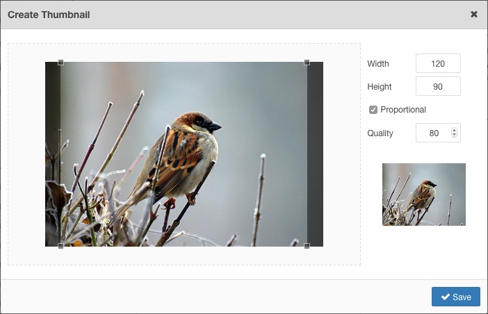
To open the Thumbnail Editor, select an image, then click on the Create Thumbnail button.
Properties
The Width and Height of the thumbnail can be set in the Properties section of the dialog. Changing the existing values will be reflected in the image in the Preview section (to a maximum of 200px x 150px, the limit of the Preview area)
By default the width and height values are constrained, ie: changing one value will calculate and set the proportional value of the other. Click on the chain icon to toggle the constrain option.
The Quality value can be set by dragging the slider, or entering a new value in factors of 10, eg: 20, 30, 40 etc. This sets the level of JPEG compression used when saving the thumbnail.
Thumbnail Area
The thumbnail area is shown in the box on the left of the dialog. This shows the area of the original image that will be used in the thumbnail and by default includes the whole image if the proportions of the original image match those of the default width and height, otherwise it will show sized to the ratio of the width and height.
You can resize the box by dragging any one of the corners. The Preview image will update with the new selection. The resized box can also be moved by dragging it around.

Saving the thumbnail
Once you are happy with your thumbnail dimensions and selection, click the Save button. The thumbnail image will be created in the thumbnails folder (as set in the Image Manager Extended parameters, or "thumbnails" by default)
Creating Popup Images
The Image Manager Extended can be used to effortlessly create "lightbox" popup images for your site by creating the code necessary to support JCE MediaBox, RokBox or WidgetKit Lightbox style popups, in just a few clicks!
It is assumed that you either have the JCE MediaBox plugin installed and published, or some other plugin, extension or template that has Rokbox or WidgetKit Lightbox support.
There are 3 methods for creating a popup :
- Creating a popup for an image that has an associated thumbnail - This method assumes that the image to be used as the main popup image already has a thumbnailed version present in the thumbnail folder, either created during the upload process or using the Thumbnail Editor.
- Creating a popup for an image that does not have an asscociated thumbnail - No thumbnail is present and one needs to be created using the Thumbnail Editor.
- Creating a popup for an image using an alternate thumbnail image - No thumbnail is present and you wish to used a different image as the thumbnail (this can be any image at all, located in any folder).
Creating a popup for an image that has an associated thumbnail
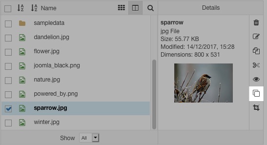
As stated above, this method assumes that a thumbnail already exists. You can check this by selecting the image (click to the right of its name), and checking to see if the thumbnail icon is a Create Thumbnail icon or a Delete Thumbnail icon. If it is the latter, a thumbnail exists, and should be located in the 'thumbnails' folder in the same directory as the image. Proceed by following these steps:
- Click the Popup Tab.
If the Popup tab is not visible, you need to download and install a popup extension, such as JCE MediaBox. - Select a Popup Type, eg: JCE MediaBox

- Select the image that is to be used as the popup image by clicking on its name in the file list. A dialog will appear asking whether you would like to use the image's associated thumbnail for the popup link, ie: the image that the visitor will click on to launch the popup. Click Yes.

- The URL field in the Popup tab will be filled with the popup image url, and the relevant fields in the Image tab will be filled with the thumbnail image values.
- To add a title and/or caption to the popup, enter text in the Title and Caption fields.

- To create a gallery of images in the popup, assign each popup link to the same group by giving each popup the same group value.

The Group or Album field is used to associate image popups, creating a popup gallery, where the visitor can naviagte from one image to the next from within a single popup. To use this feature, all the images must be on the same page (or end up on the same page within the various Joomla! content items) and have the same Group or Album name.
Example: I have created 3 popup images in my content item, and assigned them all the Group name of 'gallery'. When the visitor views any of the popups by clicking on any one of the images, navigation items are included in the popup allowing the viewer to move to the other images in the Group.
Creating a popup for an image that does not have an asscociated thumbnail
- Select the image to be used in the popup blicking to the right of the image's name.
- Click the Create Thumbnail button to open the Thumbnail Editor. Set the width and height of the thumbnail or use the default values, then drag and resize the crop window to set the focus area of the thumbnail. Click Save when complete to create the thumbnail.

- Follow steps 1 to 6 above.
Creating a popup for an image using an alternate thumbnail image
The procedure for this method is quite different to the above two in that we must manually specify which is the popup image and which is the thumbnail image. It is however, relatively straight forward and only takes a few more clicks than the above methods!
- With the Image tab selected, click on the image name of the image that is to be the thumbnail, ie: the image that will be clicked to launch the popup.
- Click the Popup tab.
- Select a Popup Type, eg: JCE MediaBox
- Click on the name of the image that is to be the popup image in the file list, ie: the image that will be disaplayed in the popup.
- As above, if this image has an associated thumbnail, you will be asked whether you would like to use this thumbnail, but this time click No.
The final steps are the same for each one of these methods.
Assign values to the Image if necessary (Align, Margin, Border etc.)
Click the Insert button.
To remove an existing Popup, set teh Popup Type to -- Not Set --, then click the Update button.
Uploading an Image
Upload Dialog
The Upload Dialog, opened by clicking the Upload icon  , is used to upload images from your local machine to a chosen directory on the web server hosting your site.
The Image Manager Extended includes options to resize and thumbnail images on upload.

To upload a file:
- Click the Browse button and locate the target file or files on your computer. Multiple files can be selected and added. Alternatively, if the Drop Files Herelabel is displayed, drag the images from your local machine into the Upload dialog.
- The files will be added to the Upload Queue.

- You can edit the file name by clicking on it or by clicking on the Rename button
 to the right of the file name. The name can only contain the characters a-z, A-Z, 0-9, period( . ), underscore( _ ) and dash ( - ). Spaces are converted to underscores, all other characters are removed.
 - You can remove the file form the queue by clicking on the Delete button

- To Resize the image, check the Resize option and set the Width and Height values if required.
- To create a Thumbnail of the image check the Thumbnail option and set the Width and Height values if required. Check the Crop To Fit option to fit the thumbnail within the given dimensions.
- The files will be added to the Upload Queue.
- Click the Upload button.
- The dialog will close automatically once uploading is complete if no error messages are reported.